
From UX Sceptics to Believers: The Transformational Impact of the Customer Onboarding Project
About
The research & redesign of human-led onboarding for a complex web application, using unconventional approaches. Compelling results transformed the company's perception of UX's impact on business, inspiring investments in UX endeavors.
Must remain hidden
Kasia Kędzielska
April 2023 – June 2023
One woman army: Kasia Kędzielska
UX research, UX design
Case study
EXEC SUMMARY
The project is divided into 2 parts. In the 1st part, I researched the onboarding process using the Mystery Shopper method and made a video with the results. This had a big impact on the company's management team, as it made them, previously skeptical, recognize the crucial role of UX design in the onboarding experience and its impact on the business. Furthermore, the research generated a concrete list of actionable items to enhance the onboarding process, addressing issues that were previously difficult to identify.
The 2nd part of the project focuses on the redesign and validation process of the most challenging onboarding area in the system for clients. Historically, clients struggled to set it up correctly, feeling stupid, and employees had to spend a lot of time explaining it individually. However, the final design (shown under the attached link) proved to be a success, as clients were able to use and understand it effectively without any external help. These findings carry considerable business value, demonstrating that it is indeed possible to create an intuitive interface in such a complex product. As a result, this saves both money and time on onboarding consultants' work, increases customer satisfaction and unlocks other business opportunities.
As a result of the project, the company is now open to considering product changes that were overlooked before. The findings led to a positive shift in their approach, opening doors to new UX and business possibilities.
THE PROBLEM WITHOUT A CAUSE
The client company (whose name will remain hidden) is a medium-sized organization (approx. 200 employees) that offers a SaaS web application for fitness business owners to manage their businesses (B2B model). The app provides various functions like schedules, webshop, workout creation, and many more, all in one product, and it is offered to businesses of all sizes worldwide (over 9k business clients in more than 80 countries).
After purchasing the subscription, the client – a business owner – needs to set up their portal to tailor it to their specific needs, use cases, and their clients – end-users who will use the system for their services (B2B2C model). Since setting up and understanding such a complex system presents a significant challenge, the company offers a high-touch onboarding process to facilitate it. The process consists of personalized tasks sent by email to clients (e.g., watching a tutorial and adding class schedules to the system) and several 1-on-1 video meetings with onboarding consultants who check if clients performed their tasks correctly and help them set up the system in the best possible way.
However, the company noticed that this process is not going as well as they would like. The internal onboarding success metrics have been quite low, and it takes overly long (even months) for clients to complete the process. Also, such onboarding model is not easily scalable. Even though the clients have been happy with their onboarding (according to NPS scores), from the company's perspective, this onboarding process is highly inefficient. However, they couldn't figure out the cause or how to fix it.
LET’S DO SOME ACTING
After I learned the details of the onboarding process from the company's perspective, the first challenge was to figure out what was wrong with it and why without being able to track or ask the clients about it while they were in the process. To overcome this, I decided to conduct a Mystery Shopper Research and go through the onboarding process myself undercover, pretending to be a regular client. I obtained management's approval, received training to act convincingly, and collaborated with Operations to ensure that every aspect of my persona seemed authentic in the system. This way, I could closely examine each step of the process (e.g., emails, meetings, onboarding materials), document them in detail, and note down any potential issues.
This research revealed numerous unexpected onboarding issues across different categories (e.g., product design, emails, materials), with the most impactful issue being the unintuitive design of the product settings.
AND WHAT WOULD OTHERS SAY?
To validate the identified issues and broaden the list with insights from another, less subjective perspective, I conducted a survey with onboarding consultants who have direct experience with clients and know the interface struggles they face. In the survey, the consultants were asked to identify and describe the most common mistakes and misunderstandings clients encounter during the onboarding process.
The survey results confirmed the identified issues related to the product design. The unintuitive interface led to clients spending a significant amount of time trying to understand the system, setting it up incorrectly, and then having to redo it, resulting in wasted time. The onboarding consultants needed to allocate a significant portion of their 1-on-1 meetings to explaining various settings in the system instead of assisting their clients in finding the best setup for their business.
SHOW TIME & REACTION
The onboarding process discoveries were later presented to the stakeholders. To provide a comprehensive view from the clients' perspective, I created a video that showcased a step-by-step journey through the eyes of a client. This video tangibly revealed the identified inconsistencies, inefficiencies, and pain points that clients encounter during the process.
The presentation received an overwhelmingly positive response. The research results effectively bridged the knowledge gap, shedding light on both the "what" and "why" of the onboarding problems, and led to a concrete list of actionable improvements. Managers promptly began addressing some of the quick-win issues, while others initiated initiatives to improve the remaining problems.
MINDSET CHANGER
There was yet another significant result of the presentation. It highlighted the enormous importance of product design on the onboarding experience and efficiency. Initially, the company focused on seeking improvements solely in tutorials, emails, and other areas, without realizing how much product design influences onboarding. However, after reviewing the research results, they started seriously considering making changes to the product design.
________________________
THE PROOF OF VALUE
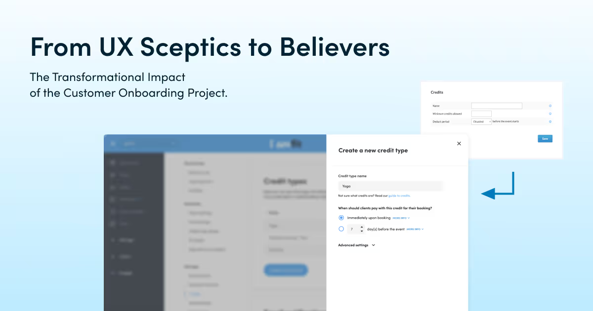
To further convince the board that redesigning product settings will bring significant business value, I focused on improving the interface of the most problematic and difficult-to-explain tab in the system settings – the Credits tab. As a proof of concept, if I can redesign this part in a way that allows clients to set it up correctly on their own during the first use, then we could do the same for other tabs. This would make the system settings clear and intuitive for clients, ultimately saving a lot of time for onboarding consultants.
FIRST SHOT
In order to understand the issues related to this part of the interface, I conducted three types of research:
- In-depth interviews with onboarding consultants from different markets, where I noted down all the mistakes and problems their clients encounter with this tab, as well as the commonly set up settings and use cases for them.
- Cognitive walkthrough to identify any usability issues.
- Internal investigation on the statistical frequency of various settings being set up, along with their corresponding use cases.
Based on the gathered information, I proceeded to design the Credits tab, with the goal of providing a clear understanding of the Credits concept and an intuitive way to set them up correctly. The main changes included adding an empty state with concept explanations and examples, using labels in the form of questions, employing more appropriate UI elements to gather users' input, and adding explanations under every field to clarify each selection's meaning. After the redesign, the RITE usability studies were conducted.
FOR THE WIN
The first session of the RITE study was a complete failure. Despite having all the explanations in place and clearer labels, a participant still set up credits incorrectly and with a wrong understanding. However, I responded by asking probing questions to understand their reasoning—why they chose certain settings, how they interpreted them, and what words they used to describe them. Using this information, I made some design adjustments, mainly by changing the wording of the questions and explanations to better align with the participants' understanding. The procedure of testing, probing, and adjusting the interface needed to be repeated 5 times, each time with a different person, to finally achieve an intuitive design—one that could be set up completely correctly and with the correct understanding. The graphics depicting the original Credits creation form, the first tested proposal and the final version, are presented under the attached link (it’s recommended to take a look there).
UXING IMPACT
Based on the use cases analysis and RITE testing, users progressed from initially struggling to set up and understand the credits to achieving complete independence, successfully configuring everything on their own from the first try. This discovery holds significant business value as it indicates that the settings process can be made user-friendly enough to reduce or even eliminate the need for onboarding consultants to explain it and/or watching hours of tutorials. This would save money on consultants time, increase client satisfaction during onboarding, and create other business opportunities.
Based on the results of this research and redesign processes, the company acknowledged the significant importance and impact of UX design on the business metrics. The new design of the Credits tab was formally suggested for potential future developments in the product, and the recommendations to follow the research and redesign process to improve all of the system settings initiated a new conversation within the board and the management team.
_______________________
Lessons learned:
– Mystery shopper research proved to be an effective method for mapping the customer journey in great detail and creating a “wow” effect on stakeholders.
– Sharing the research results in an attractive and visual manner is crucial for effectively communicating research knowledge and capturing people's attention.
– Expert inspection alone is not sufficient; actual testing is essential to identify and improve problems.
– UX writing plays a critical role. Microcopy significantly influences users' understanding of the interface; it can make or break their comprehension.
– Considering use cases can enhance the effectiveness of the interface.
– When trying to convince people about something, it's helpful to start with a minimum proof of concept to demonstrate the idea on a small scale, and then storytell how beneficial it would be to apply it to a larger scale.
Parts of this project were used in my final Master's thesis, which enabled me to obtain my degree in Human-Computer Interaction and Design.
Why us?
Because I believe that the described learnings (transforming UX skeptics into believers, importance of testing, UX writing, and use cases) and ideas (mystery shopper, video) are worth sharing in the Product Design world.