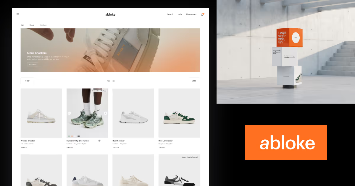
abloke - lifestyle store


About
same
abloke
Abysso
Dec 2022 - Feb 2023
Dominik Tyka - Visual director & UI/UX
Figma
UI/UX
Case study
abloke is an online lifestyle store. The main assortment are sneakers. These are high quality products - this is what the project was supposed to be. We went for total minimalism with great care and focus on usability of users using the site. As with the website - logo, or rather logotype was supposed to be simple. We bet on the slant of the letter "a" in the name, to show the dynamics that the shoes that the store offers. Staying with all of this - even long term use staying in its original shape.
Why us?
Tn the web3, I believe that projects of this type are becoming less and less appreciated. As simple as possible, where it's usability that plays a major role. Especially in this type of product such as a store, where the products "decorate"


